Showing posts with label digital scrapping. Show all posts

Wednesday, 17 September 2014

I love you - A Craft Artist 2 project tutorial

Hi all

Here's another tutorial for you. I have again used a digi kit from Sahlin Studios with Craft Artist 2 professional. You don't have to use the content I have or indeed follow the design to the letter, I want you to be inspired to create with any of the digi kits you have and make it your own .... unleash your creativity. Maybe you will be inspired to do a real life page using my design for a scrap lift or combine the two and go hybrid.

This is the project I am going to put together for you

I Love you
 

I have used the Grandma's dresser digi kit from Sahlin studios, an eclectic mix of stuff! My page set up is actually a 5 x 5 card.
 

I added the background from the kit and then added the card from the embellishments. I wanted to put this card in a frame, it doesn't always have to be a photo! As I needed the intelligent digi frame to recognise the card as a photo though I needed to convert it so while it was selected I went to the top tool bar and clicked tools, from the drop down I selected convert to picture and clicked ok in the pop up box that appeared, this meant it was now a photo ....


.... and when I dragged and dropped a frame onto it the card snapped into the frame which I then resized and positioned. You will see I have left a gap at the bottom ....


.... This was to allow space for my sentiment from the embellishments, there are lots of cross stitched words in the kit in black and white that can be recoloured as I did here by selecting red from the colour box. The black and white embellishments recolour very differently.


I then started building onto my design. I added the string behind the frame to lift it off the page.


And then I added the lovely metal heart on top remembering to shadow it to bring it all to life.


The circle of the heart was crying out for something so I added a crocheted rose creating more layers to the page.


And then grounded the rose by using the leaf embellishment in the kit. It has a button on it but by arranging the leaves behind these are not seen. (I added 3 of these)


The bird sat perfectly on top of the rose and broke up the line of the heart and with a shadow looked ready to take flight.


And then I wanted to add more interest to the background to finish my design so I used the typed word embellishment arranged all the way to the back layer. To save me copying and pasting I clicked on the stamp mode tool on the 3rd tool bar while the embellishment was selected and stamped the words all over my page, then arranged each one to the back.

 
And that was the front of the card simply done but with lots of layers and textures. Remembering this was a card template I decorated the insert and the back of the card for a professional finish!
 
I hope you feel inspired and see how quickly a project can come together sometimes! Thanks for popping by, I hope you are well and happy! I will be back soon so as ever, until then,
Happy Crafting
Love
MJM x


Monday, 15 September 2014

Forever Blowing Bubbles - A Craft Artist 2 project tutorial

Hi all

Here I am again with another tutorial for you. I have again used a digi kit from Sahlin Studios with Craft Artist 2 professional. As I said in the last tutorial  you don't have to use the content I have or indeed follow the design to the letter, I am hoping that you may be inspired to create with any of the digi kits you have, .... make it your own, after all that is what creativity is about. Maybe you will be inspired to do a real life page using my design for a scrap lift or combine the two and go hybrid.

This is the project I am going to put together for you

Forever Blowing Bubbles
 
I have used the Retro Mod kit from Sahlin Studios for my project. My page set up is a 12 x 12
 

I added the background by dragging and dropping it into my workspace and then added the photos I wanted to use to my photo tab. As I said before I like to add my photo first most of the time so I did that making it about 5.5'' x 4'' but didn't use an intelligent photo frame this time as I wanted to apply an effect to the photo instead via the photo lab tab on the 3rd tool bar.


The photo lab is launched by clicking the icon while the photo is selected. The page curl I wanted to apply is found in the effects tab in the style section and once the effect is clicked it travels across the photo adding the effect and opening a tab on the right where it can be adjusted, in this case I altered the horizontal and vertical values as well as the radius ones. Play about until you are happy then click ok, a pop up box will ask if you want to commit, click yes and you will be returned to your workspace (if you don't like the effect just click the undo tab on the 2nd tool bar!)


Next I wanted to use the small negative strip to add a couple of small photos. The intelligent digi frame version of this splits one photo in to two but there is the same strip in the embellishments which is what I used as I wanted to use two different photos. I dragged my photos on and arranged them behind the frame, sizing until the focal point of the photo was within the frame and then while it was still selected I picked up the crop tool on the 2nd tool bar and cropped the edges in until they were behind the frame by using the white nodules round the sides. I did this for both photos and then drew an imaginary box around the frame with my cursor so it snapped to the edges and clicked group on the bottom right corner so the whole thing would move as one unit if I needed to reposition it.


Next thing was to start building layers. I used a square of material from the materials tab as a base layer to ground the photos and also to give a focus for them. I then added the book page from the embellishments so the pattern of the material didn't distract too much. I places ribbons across the page arranged back and front to lead the eye across the layout and added some paper tabs along the negative strip edge to lift it away from the busy pattern behind. I started to add small details to like the staples at the end of the ric rac, the word confetti tabs to add to my story and a journal tab along the negative strip to add text to later. All the while I added shadows using the styles tab for quickness and to make sure the page came alive.


I wanted to pull some of the yellow through my design to brighten the page so chose to do this with some punched circles which lend themselves to the bubble title of my layout, however circles are also a great way of breaking up straight lines on a layout as well as adding splashes of different colours. I added some material to my grey space (which I use as my craft desk) and then dragged on the circle punch from the punch tab, dragging it onto the material. The punch can be resized and if you hold the ctrl key down while doing this (control key) you will find it stays a perfect circle and will also stay in the centre of the circle already punched. As you can see I punched one circle, reduced the size of the punch and punched the centre out to create a ring (click punch at bottom right to punch and just delete the bits you don't want. I then positioned the rings on the page, shadowing them and using the arrange tab to send behind the layers. You only need a little bit of the circle peeking out in places to create some movement on your layout.


Another little detail I added was the paperclip from the embellishments, I wanted it to look like it was holding the strip in place so while it was selected I picked up the erase tool on the 2nd tool bar and erased away a little of the centre of it so when it was added to the top of the photo strip it looked like part of it was behind as a real paper clip would.


More embellishments were added in the form of flowers, these break up the ends of the ribbon strips softening the lines while also creating more interest and layers to the page. Sizing is easier using the photo as a reference for the size of them. Arrange them so they overlap and don't forget the all important shadows. The tapestry flowers in the kit are brill, they look like they are really stitched on the page, to that end make sure they go all the way back to the background layer so the end of the ribbons sit over the stitches in this case


My title was added using the kit alphabet by typing what I wanted in the little white box at the bottom of the tab and clicking insert (group them all straight away so they can be sized and moved as one unit)


And my little bit of journaling (names and date) was added using the text tool. Click the text tool and click onto the grey space, select a typeset and a size and then type (you can click edit points to wrap or stretch your text if you want) I turned it with the ball tool and positioned it on the tab, shrinking it to size.


And that's it, a happy summery page, although it would work well for Autumn too! This page uses strong patterns but works because they are broken up with layers that allow the photos to breath and the circles add a softness as well as a splash of colour to lift the whole page.
 
I hope you have enjoyed my tutorial and feel inspired to create something in your own unique way! Thanks for popping by and I hope to see you again soon, until then, as ever
Happy Crafting
Love
MJM x 
 

Thursday, 11 September 2014

A perfect summer day - A Craft Artist 2 project tutorial

Hi all

Well as promised I am posting a tutorial using some kits I recently had on Create and Craft TV. They are from Sahlin Studios (I love them!) and obviously I am using Craft Artist 2 professional. Having said that I am hoping that my tutorials may inspire you to create with any of the digi kits you have, you don't have to use the content I have or indeed follow the design to the letter .... make it your own, after all that is what creativity is about right? Maybe you will be inspired to do a real life page too using my design for a scrap lift or combine the two and go hybrid.

This is the page I am going to put together for you

A perfect summer day

It uses mainly the Vintage Carnival digi kit from Sahlin studios and I think it is a great design for any perfect summer day you may have had, mine is with hubs at the Rewind 80's festival.

 
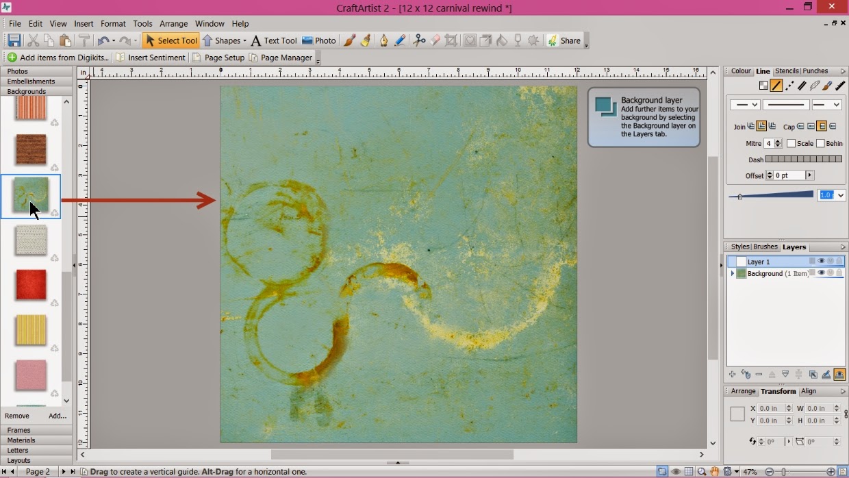
My page set up is 12 x 12 and I have added the Sahlin studios Vintage Carnival digi kit I then added this fabulous grungey green paper to my work space.


I usually start with my photo when creating a layout (not always ... its not a rule!) as I can get that the right size and then it leads to the rest of the layout build and as it's digital I can 'craft backwards' where as with real life crafting I would need layers down first iykwim!
I made the polaroid type frame just shy of 5'' x 4''. You can check the size with the numbers around the edge of your selected piece as you re size with the corner nodules and you can also fine tune via the transform tab on the right by altering the values in the W (width) and H (height) box.
Don't forget to shadow as you go! I like to use the pre installed shadows in the styles tab as it is quick and easy. I also tend to go for a bottom right shadow most of the time and quite a deep shadow (though don't have it too dark!)


I then added the negative black strip frame. Using the arrange tab on the bottom right I rotated it to a horizontal position and sent it behind the polaroid frame. It is about 10'' x 2''


By clicking add at the bottom of the photo tab I added the photos I wanted for my project from my files and then dragged and dropped them into the relevant frames. The negative strip splits the photo into sections and my photo was a panoramic shot so it came in to the work space mahoosive!! Simply remedied though by clicking on the 'select cropped item' button on the bottom right corner of the frame which activated the photo and allowed me to resize it into the frame.


To lift the polaroid photo and to connect the two photos together I wanted a bright layer so I added the yellow and pink striped material to my grey space (I use this like a craft desk) Then went to tools on the top bar and from the drop down menu selected convert to picture (while the material is selected!)


A pop up box appears and to be honest I just click ok as I don't understand the numbers :)


This means my material now became a photo and allowed me to add a frame on top of it by dragging and dropping it into place. I then resized the frame to 8'' wide and dragged it down slightly to make the height about 4.5''


I positioned the stripey layer behind the polaroid and over the negative using the arrange tab. It creates a focal point for the main photo but also pulls the negative strip into the design by touching it. Remember the shadow!


Next to add was the embellishments. I won't do a screen shot for everyone as that would get rather boring :) They simply drag and drop into place, resize them as you go and sizing is now easier using the size of the photos as a reference. Arrange things backwards and forwards to create layers and remember to shadow as you go. I will just point out the ribbon I added behind the negative strip and the diamond border, although not a lot of either is seen it pulls the eye across the page and also grounds the negative strip on the layout.


I added the bunting but wanted it quite large ... it looks a bit dominant right? But ....


.... by then adding the Ferris wheel behind it, it links the elements together as well as grounding the bunting on the layout.


I added my place and date using the alphabet in the kit. Type the words you want in the white box at the bottom of the letters tab, click insert and click group at the bottom right of the words straight away so they can be resized and positioned together. Add shadow!


I added an extra embellishment from the kit under the letters again to ground them and then wanted to balance it on the right with a barcode I knew was in one of the other Sahlin studio kits so I clicked add at the bottom of the embellishment tab ...


... which launched my digi kit browser and instead of trawling through all my kits I used the search box on the right then clicked the embellishment so it had a green tick so it sent it into my workspace.


I added the barcode and then added the fab handwritten words from the Vintage carnival embellishments however I didn't want the arrows so while the embellishment was selected I clicked on the eraser tool on the tool bar ....

 
.... and erased away the arrow! I then positioned the writing on the frame of the polaroid so it looks like I have written on it ....


.... and added my title to the actual photograph .... and that's it a finished layout with lots of layers and gorgeous 'stuff' from the kit.

A busy page isn't complicated, its all about arranging your layers, connecting all the elements and getting the size of each piece right.

I hope you enjoyed my page tutorial and I hope it inspires you to create something in your own way. Thanks for popping by and I'll be back soon with another tutorial, until then, as ever
Happy Crafting!
Love
MJM x

Sunday, 18 May 2014

Timeless, Elegant Grunge!

Hi all

This past week we had a 4 Day Deal on Create and Craft TV from Serif and Graphic Authority. Unfortunately I wasn't able to be with you all at the beginning of the week but did my Ninja Demo'er trick on Thursday and guested for the last show. I absolutely LOVE the kits we had on:
http://www.createandcraft.tv/Graphic_Authority_Timeless_and_The_Edge_Collections_CD_ROMs_308845.aspx?fh_location=//createandcraft/en_GB/$s=serif
(exclusive to Create and Craft tv until the end of June 2014)
 
At this point I am calling not only all digi crafters to do yourselves a favour and grab these kits but also I am shouting out to all my other crafty friends .... even if you have never digi crafted or had any desire to, this is an ultimate collection to create your own papers to craft with however you want! And don't think of it as just the titles, yes the 8 Timeless kits have a heritage feel and The Edge Grunge and Elegant suit their names BUT think outside the box! Layered on different backgrounds and using different colours these kits can be any style you want! I think it is genius (while also feeling a little guilty about giving away trade secrets on how layers in papers are created especially when it is so easy at the touch of a button with CraftArtist 2 professional!)
 
http://www.serif.com/craftartist/
 
You will need this software to access the digi kit contents but let me tell you it is soooo worth it! Overlays galore to create with; splats, creases, patterns, distressing, text, flourishes ...... and it goes on! Colour them, blend them, digi stamp them, make them metal .... your creative imagination is your own limit! 

I thought I would share some of my sample pics in this post and then I am planning to do a few tutorial posts soon to show you how easy it is to create unique, professional looking backgrounds with these kits ;)
These 3 projects are mainly created with The Edge Grunge digi kit .... with different colours and effects they all look so different!


These 3 projects are mainly created from the 4 Timeless 1 kits


While these 3 are created mainly using the 4 Timeless 2 kits ... look at the variation!


And finally these 3 projects are created mainly with The Edge Elegant kit


And these are pics of some of the other samples on the show created by the Serif DT a beautiful vintage feel to these!
There is hours of fun to be had with these kits and hundreds of bespoke backgrounds to create! I'll be back soon with some tutorials to help you on your way to creating and will be back sooner with some pics of my fabulous floral trip to Chatsworth :)
 
Thanks for popping by and I hope you're all well and happy! So until soon, as ever,
Happy Crafting!
Love
MJM x