Hi all
I've created another tutorial for you using digi kits from the Victoria Nelson collection using Craft Artist 2 professional. Remember you don't have to use the content I have or follow the design to the letter make it your own .... unleash your creativity.
This is the piece of home décor I am going to create
I created it on a 12 x 12 page set up and the finished piece is about 10 x 10. I have used the Victoria Nelson Bird Garden digi kit .... so pretty!
I added some material to my page and resized it almost to the edges, I then aligned it centrally with the vertical and horizontal buttons in the align tab bottom right, this meant that every layer would sit in exactly the right place as I aligned each one the same as I built up the design, even the circle punch that I dragged on a resized was aligned centrally every time. (If you hold the CTRL or control key down as you resize the punch it will stay perfectly circular for you!)
Before I punched the circle I added a decorative edge to the punch by going to the third tool bar while the punch was selected and from the scissor type drop down menu selected the bump edge and then increased the wavelength and amplitude values (play around with these to get the pattern you want, I always call it the smoothness and bumpiness :D) When I was happy I clicked punch on the bottom right corner and deleted the waste area.
I added two more layers of material in the same way, aligning them to the centre and adding shadows to bring the design to life.
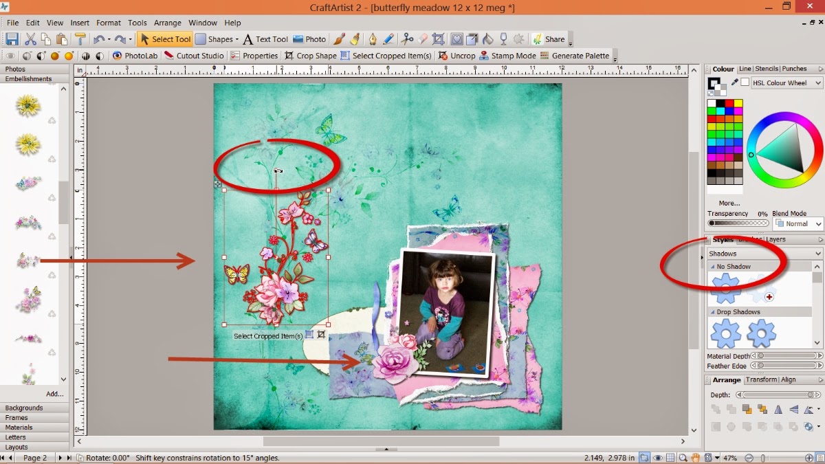
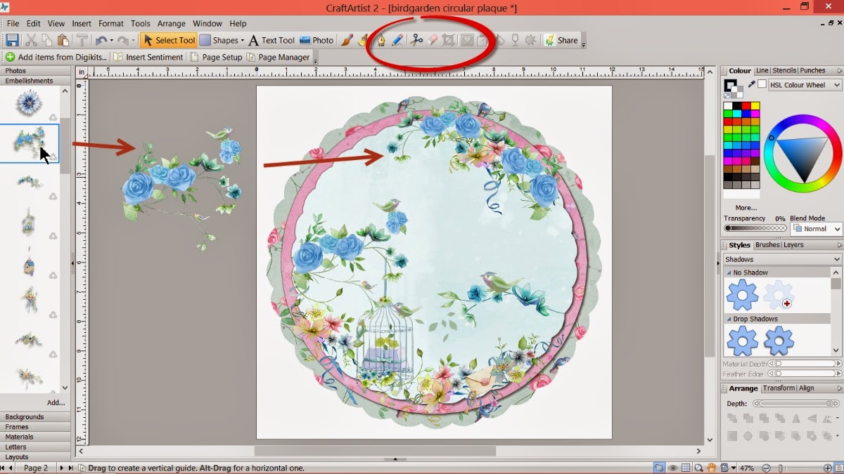
I then started adding the pretty embellishments to build my design ....
.... twisting things with the ball tool and flipping them if necessary with the tools in the arrange tab. I also erased away bits of the images if they didn't look right or over hung my design by selecting the embellishment and picking up the erase tool on the 2nd tool bar.
I added further detail with the envelope and keys embellishments after erasing away the bits I didn't want and re sizing them accordingly then adding them in place arranging them backwards via the arrange tab.
I continued to add detail to the top right of my design to balance it, again twisting etc as needed and erasing bits I didn't want ....
.... like the birds on the blue roses.
And lastly I added my quote using the text tool. Click on the A text tool button, click on your work space, choose a font and size and type then click edit points on the bottom right and push against the wrap text nodule to put the text in a line, clicking the centre button under the text tool button aligns the words accordingly. I also recoloured the lettering with the colour palette.
And that's it a pretty piece of home décor. You could just print it out and hang it on the wall, you could add it to a wooden plaque, you could print off the separate layers and hybrid it or add it into another design the choice is yours!
I hope you have enjoyed this tutorial and I thank you for popping by. I'll see you soon but maybe a little while longer than normal as I have some shows to prep for so bare with me ;) but until then, as always
Happy Crafting
Love
MJM x
Showing posts with label Victoria nelson. Show all posts
Sunday, 28 September 2014
Thursday, 25 September 2014
Our Little Butterfly - A Craft Artist 2 project tutorial
Hi all
Here's another tutorial for you. I have used a digi kit from the Victoria Nelson collection I recently had on Create & Craft TV and it is created with Craft Artist 2 professional. As ever you don't have to use the content I have or indeed follow the design to the letter, I want you to be inspired to create with any of the digi kits you have and make it your own .... unleash your creativity. Maybe you will be inspired to do a real life page using my design for a scrap lift or combine the two and go hybrid.
This is the project I am creating today
I used the Butterfly meadow digi kit and my page set up is a 12 x 12. I dragged and dropped the background in to place and then added the beautiful tree from the embellishments, dragging out the corners to resize it to the full height of the page.
While the tree was still selected I went to the blend mode tab found just under the colour box on the right and chose colour burn to blend the tree into the background so it added to my design but didn't dominate it. It also fills in the 'white space' that I intended to leave.
After clicking add at the bottom of the photo tab and adding my photograph I dragged it into position on my page, resized it to about 4'' x 3'' and then while it was still selected went to the styles tab on the right. From the drop down menu I selected lines and chose the heavy weight line which applied a line around my photo and then recoloured the line via the colour box. This is a way of framing a photo to make it pop without using an intelligent frame and without having to create a mat for it.
I wanted to maximise the use of the lovely materials in the kit and also add layers behind my photo to lift it. I dragged on some material and while it was selected I picked up the scissor tool on the top tool bar. I then proceeded to cut a random mat of the material (do this behind the photo so you can guage the size, I have it on the grey space in this picture so you can see what I did easier!) You need to cut of the material to off the material and click on the sections to discard. I used quite a raggy free form line to replicate a rip.
Once I had cut the mat and while it was still selected I went to the brushes tab on the right and chose edges from the drop down menu and then selected grunge to make the material look even more distressed. While it is all selected you can go to the line tab at the top on the right and increase or decrease the points value of the line to adjust the effect how you want it.
To further create the illusion of torn paper I then drew a rectangle with the shape tool and filled it with white, I sent it behind the pink material and roughly followed the cut lines again with the scissors. I then went back to the brushes > edges > grunge and increased the line (the shape you have drawn will increase in size when the effect is applied) I then pushed in the side nodes of the white shape so little bits could be seen around the edge of the pink material.
I drew an imaginary box around both layers with my cursor and then grouped the two layers together.
I positioned the pink mat behind the photo using the arrange tab and then repeated the above to create a purple mat behind it.
To create even more layers I roughly cut some more of the materials, adding the grunge edges as before but this time didn't add the white behind as this would have become too dominant in the design. I also at this point used the shadow section in the styles tab to add shadows to my layers to bring it all to life.
I then started to add some of the beautiful flower embellishments, turning them with the ball tool and flipping them with the horizontal and vertical buttons in the arrange tab, placing them around the photo to break up the hard lines.
I used one of the journal card ovals to lift the end of the material strip and recoloured the flourishes which I added behind the top edge of the mats, again to lift the colours.
I twisted and flipped some of the delicate long flower arrangements, putting the bulk of them behind the large rows to lead the eye across the design with the delicate twigs and flowers.
.... and then added ribbon from the Bird Garden kit, resizing it and following the horizontal line of the bottom of the photo, again leading the eye across the design.
I added some extra detail with a pearl and the metal heart and added the pretty tag from the kit to look like it is hanging from the top of the page, this pulls the eye up through the design and balances it out.
And lastly I added a bit of journaling using the text tool, writing it out, clicking edit points on the bottom and then wrapping the text into a line, using the centre button under the text tool to align it.
And that's it a pretty page with lots of layers. I have mentioned a few times about scrap lifting my designs if you want to and even I do that with my designs sometimes ;) These are a couple of alternative layouts I created following the same design.
MJM x
Here's another tutorial for you. I have used a digi kit from the Victoria Nelson collection I recently had on Create & Craft TV and it is created with Craft Artist 2 professional. As ever you don't have to use the content I have or indeed follow the design to the letter, I want you to be inspired to create with any of the digi kits you have and make it your own .... unleash your creativity. Maybe you will be inspired to do a real life page using my design for a scrap lift or combine the two and go hybrid.
This is the project I am creating today
Our Little Butterfly
I used the Butterfly meadow digi kit and my page set up is a 12 x 12. I dragged and dropped the background in to place and then added the beautiful tree from the embellishments, dragging out the corners to resize it to the full height of the page.
While the tree was still selected I went to the blend mode tab found just under the colour box on the right and chose colour burn to blend the tree into the background so it added to my design but didn't dominate it. It also fills in the 'white space' that I intended to leave.
After clicking add at the bottom of the photo tab and adding my photograph I dragged it into position on my page, resized it to about 4'' x 3'' and then while it was still selected went to the styles tab on the right. From the drop down menu I selected lines and chose the heavy weight line which applied a line around my photo and then recoloured the line via the colour box. This is a way of framing a photo to make it pop without using an intelligent frame and without having to create a mat for it.
I wanted to maximise the use of the lovely materials in the kit and also add layers behind my photo to lift it. I dragged on some material and while it was selected I picked up the scissor tool on the top tool bar. I then proceeded to cut a random mat of the material (do this behind the photo so you can guage the size, I have it on the grey space in this picture so you can see what I did easier!) You need to cut of the material to off the material and click on the sections to discard. I used quite a raggy free form line to replicate a rip.
Once I had cut the mat and while it was still selected I went to the brushes tab on the right and chose edges from the drop down menu and then selected grunge to make the material look even more distressed. While it is all selected you can go to the line tab at the top on the right and increase or decrease the points value of the line to adjust the effect how you want it.
To further create the illusion of torn paper I then drew a rectangle with the shape tool and filled it with white, I sent it behind the pink material and roughly followed the cut lines again with the scissors. I then went back to the brushes > edges > grunge and increased the line (the shape you have drawn will increase in size when the effect is applied) I then pushed in the side nodes of the white shape so little bits could be seen around the edge of the pink material.
I drew an imaginary box around both layers with my cursor and then grouped the two layers together.
I positioned the pink mat behind the photo using the arrange tab and then repeated the above to create a purple mat behind it.
To create even more layers I roughly cut some more of the materials, adding the grunge edges as before but this time didn't add the white behind as this would have become too dominant in the design. I also at this point used the shadow section in the styles tab to add shadows to my layers to bring it all to life.
I then started to add some of the beautiful flower embellishments, turning them with the ball tool and flipping them with the horizontal and vertical buttons in the arrange tab, placing them around the photo to break up the hard lines.
I used one of the journal card ovals to lift the end of the material strip and recoloured the flourishes which I added behind the top edge of the mats, again to lift the colours.
I twisted and flipped some of the delicate long flower arrangements, putting the bulk of them behind the large rows to lead the eye across the design with the delicate twigs and flowers.
.... and then added ribbon from the Bird Garden kit, resizing it and following the horizontal line of the bottom of the photo, again leading the eye across the design.
I added some extra detail with a pearl and the metal heart and added the pretty tag from the kit to look like it is hanging from the top of the page, this pulls the eye up through the design and balances it out.
And lastly I added a bit of journaling using the text tool, writing it out, clicking edit points on the bottom and then wrapping the text into a line, using the centre button under the text tool to align it.
And that's it a pretty page with lots of layers. I have mentioned a few times about scrap lifting my designs if you want to and even I do that with my designs sometimes ;) These are a couple of alternative layouts I created following the same design.
While you were sleeping is created using the Daisy Trail Butterfly Creations kit
Be you is created using the Kreative by Karen Ruth digi kit.
Thanks for popping by and I hope you feel inspired to get creative. I will be back soon and hope you are all well and happy, until then, as ever
Happy Crafting
LoveMJM x
Subscribe to:
Comments (Atom)


