Here's another tutorial for you. I have again used a digi kit from Sahlin Studios with Craft Artist 2 professional. You don't have to use the content I have or indeed follow the design to the letter, I want you to be inspired to create with any of the digi kits you have and make it your own .... unleash your creativity. Maybe you will be inspired to do a real life page using my design for a scrap lift or combine the two and go hybrid.
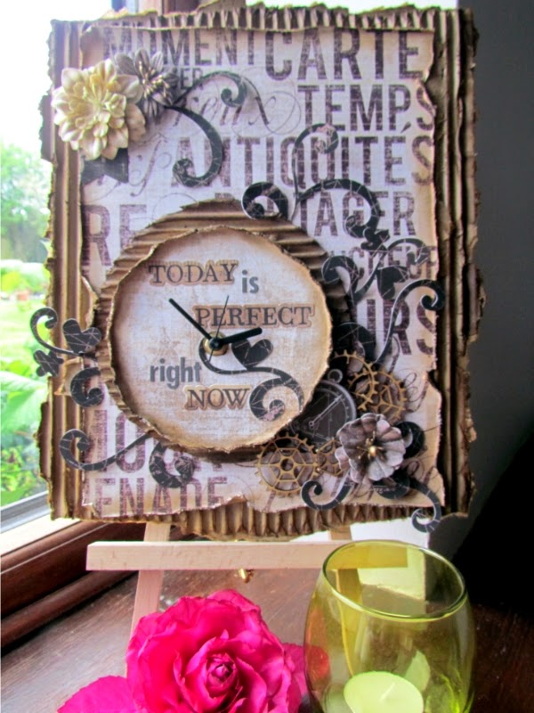
This is the project I am going to put together for you

I Love you
I have used the Grandma's dresser digi kit from Sahlin studios, an eclectic mix of stuff! My page set up is actually a 5 x 5 card.

I added the background from the kit and then added the card from the embellishments. I wanted to put this card in a frame, it doesn't always have to be a photo! As I needed the intelligent digi frame to recognise the card as a photo though I needed to convert it so while it was selected I went to the top tool bar and clicked tools, from the drop down I selected convert to picture and clicked ok in the pop up box that appeared, this meant it was now a photo ....

.... and when I dragged and dropped a frame onto it the card snapped into the frame which I then resized and positioned. You will see I have left a gap at the bottom ....

.... This was to allow space for my sentiment from the embellishments, there are lots of cross stitched words in the kit in black and white that can be recoloured as I did here by selecting red from the colour box. The black and white embellishments recolour very differently.

I then started building onto my design. I added the string behind the frame to lift it off the page.

And then I added the lovely metal heart on top remembering to shadow it to bring it all to life.

The circle of the heart was crying out for something so I added a crocheted rose creating more layers to the page.

And then grounded the rose by using the leaf embellishment in the kit. It has a button on it but by arranging the leaves behind these are not seen. (I added 3 of these)

The bird sat perfectly on top of the rose and broke up the line of the heart and with a shadow looked ready to take flight.

And then I wanted to add more interest to the background to finish my design so I used the typed word embellishment arranged all the way to the back layer. To save me copying and pasting I clicked on the stamp mode tool on the 3rd tool bar while the embellishment was selected and stamped the words all over my page, then arranged each one to the back.

And that was the front of the card simply done but with lots of layers and textures. Remembering this was a card template I decorated the insert and the back of the card for a professional finish!
I hope you feel inspired and see how quickly a project can come together sometimes! Thanks for popping by, I hope you are well and happy! I will be back soon so as ever, until then,
Happy Crafting
Love
MJM x


.jpg)